Northern Fiber Holding
Northern Fiber Holding unites three established brands in the telecommunications sector with lünecom, sewikom, and terralink. Until now, these brands operated without unified design guidelines, which highlighted the need for a structured and scalable design system. The developed modular design system ensures a consistent user experience across all touchpoints through reusable components and enables efficient integration of future brands while increasing visual consistency.
Creative Art Direction: Andreas Binar / Agency: TAU Berlin / Motion-Design: Martin Speidel
Northern Fiber Holding
Northern Fiber Holding unites three established brands in the telecommunications sector with lünecom, sewikom, and terralink. Until now, these brands operated without unified design guidelines, which highlighted the need for a structured and scalable design system. The developed modular design system ensures a consistent user experience across all touchpoints through reusable components and enables efficient integration of future brands while increasing visual consistency.
Creative Direction: Andreas Binar / Art Direction: Andreas Binar / Agentur: TAU Berlin / Motion-Designer: Martin Speidel, Vincent Schwenk
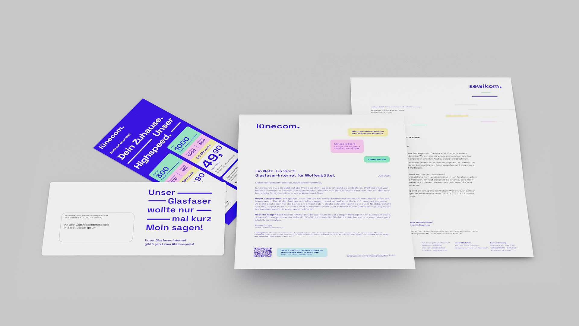
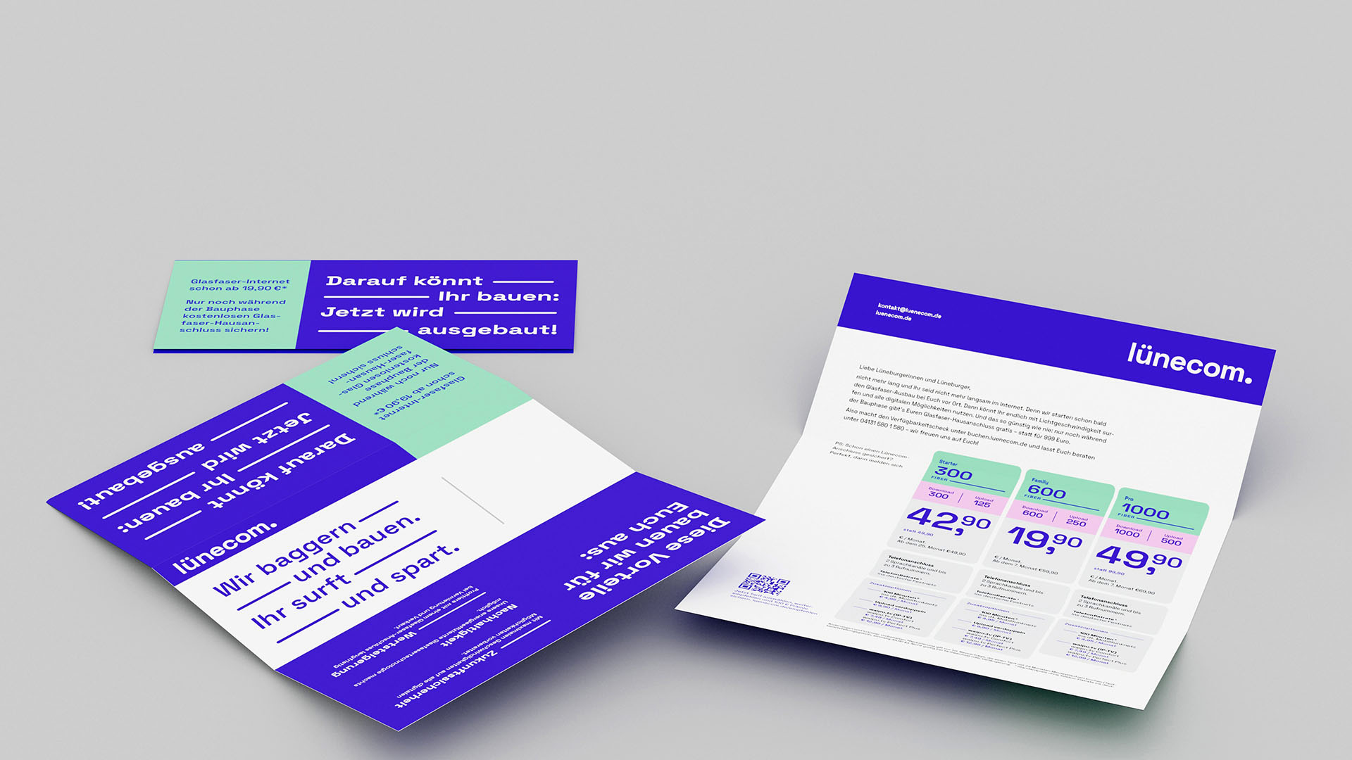
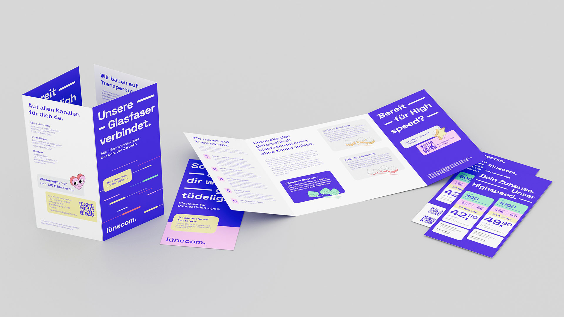
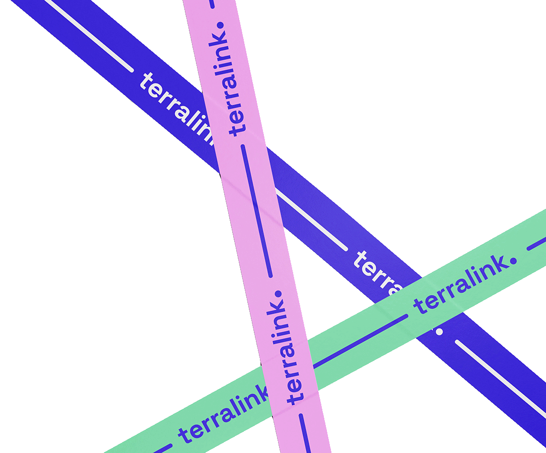
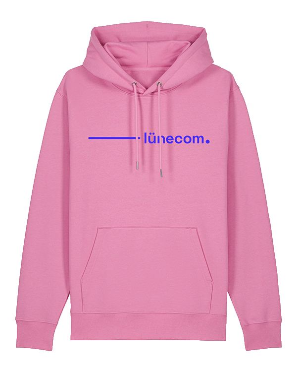
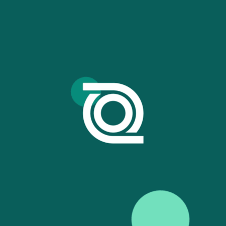
The design of Northern Fiber Holding's product brands is derived from the umbrella brand. The basic shape of the logo mark - the circle with stylized fiber optic cables - is also used for the product brands. The circle (dot) simultaneously reminds of the basic surface of the fiber optic cable in cross-section.
For the product brands, it is placed at the end of the word mark. This allows the range of product brands to be expanded as needed while maintaining a visible family connection.
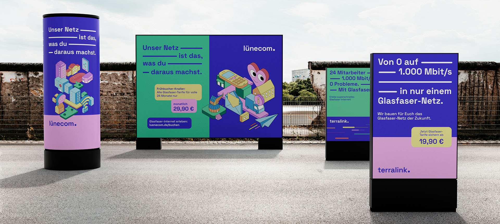
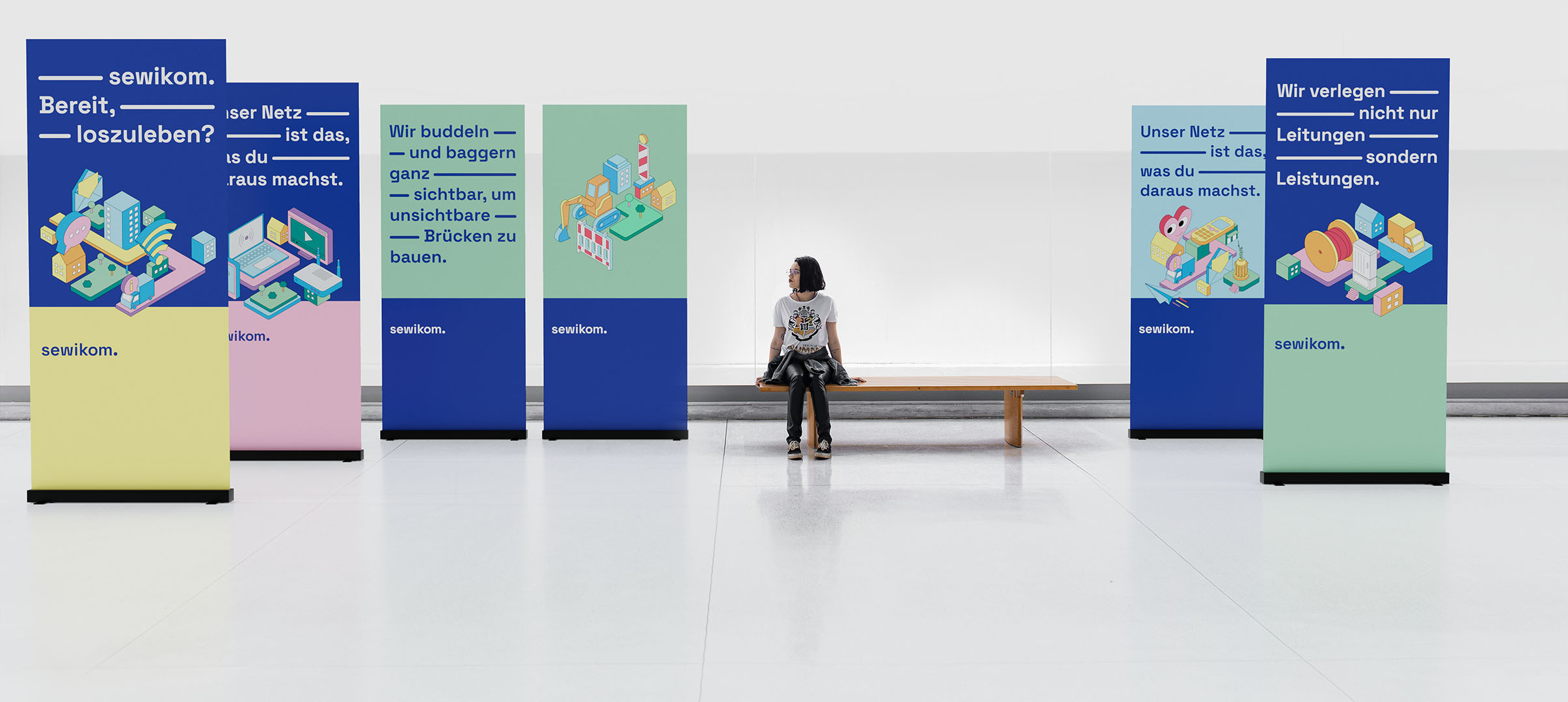
Design Principle "Beam"
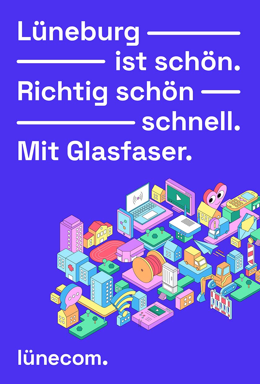
The Beam is used as a central design element across the entire brand. It is derived from the circle element (Dot) in the logo, which is accelerated and thus becomes a line (Beam). The Beam thereby symbolizes both the high speed that can be achieved through fiber optics.
Additionally, the Beam serves as a connecting line, representing the connection between people, products, and technologies.

The Beam can be flexibly used as a brand-defining design element, in combination with typography or only in combination with the logo.
Custom Beam System
A custom OpenType system enables all departments to create the signature Beam connections between words with a simple keyboard shortcut. The length of the Beam can be precisely adjusted in individual steps. This user-friendly integration ensures that the brand-defining typography appears consistent and uniform throughout all external communications
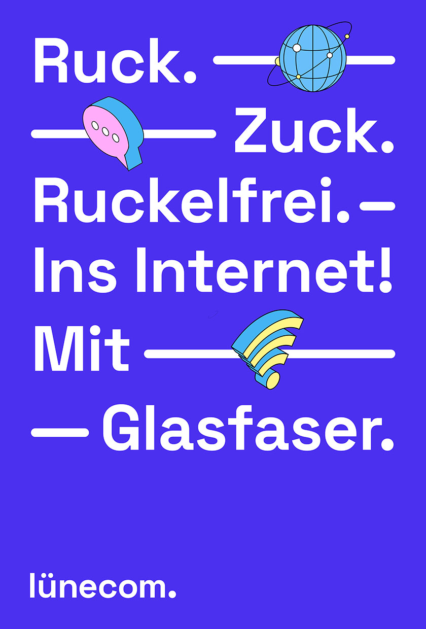
Chatbox
A characteristic element of the corporate design is the chatbox. With its rounded corners, it references the appearance of message boxes. Multiple chatboxes can be displayed, arranged one below the other to resemble chat histories. The chatbox is used to highlight content.


quantilopeCorporate Design

Das Erste / ARD aktuellBranding

WDR / Studio ZweiMotion Design
Villa IchonUI/UX
Stübbe / X-ClassMotion Design
Schoppe Instant BeveragesCorporate Design
360° VR3D, UI/UX
Volkswagen Around The WorldMotion Design
Osteopathie MKCorporate Design
Continental / Brake TestMotion Design
Arte / Tracks NightMotion Design

Agenda VermittlerMotion Design